The team at Mobiddiction used Neomorphism principles and worked together with Stay Upright and their agency to design, build a new website for Stay Upright.
Stay Upright
The Brief
Overview of solution
Stay Upright Pty Ltd is nationally accredited by ASQA and is also accredited to provide training and testing services by VicRoads, Transport for NSW (TfNSW), the ACT Government, Queensland Department of Transport and Main Roads. Our task was to create a new refreshed web experience for Stay Upright customers digitally.
Consult & Collaborate
Design & Develop
Deliver &
Manage

Three important things
Simple UX
Integrated Payment
Scalable & Support
Background
Australia’s favourite motorcycle school
Stay Upright offers a range of courses for all levels of rider, across five states. With over 130 qualified staff and 40 years in the business Stay Upright offers beginner to an advanced rider training courses across all Australian states right from getting a motorcycle licence, developing road riding, or learning some off road riding skills. They also provide formal rider training for employment requirements.

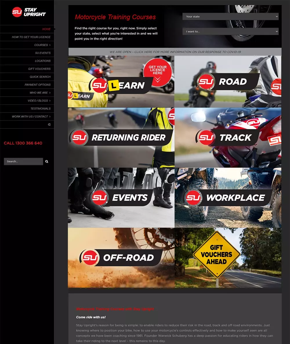
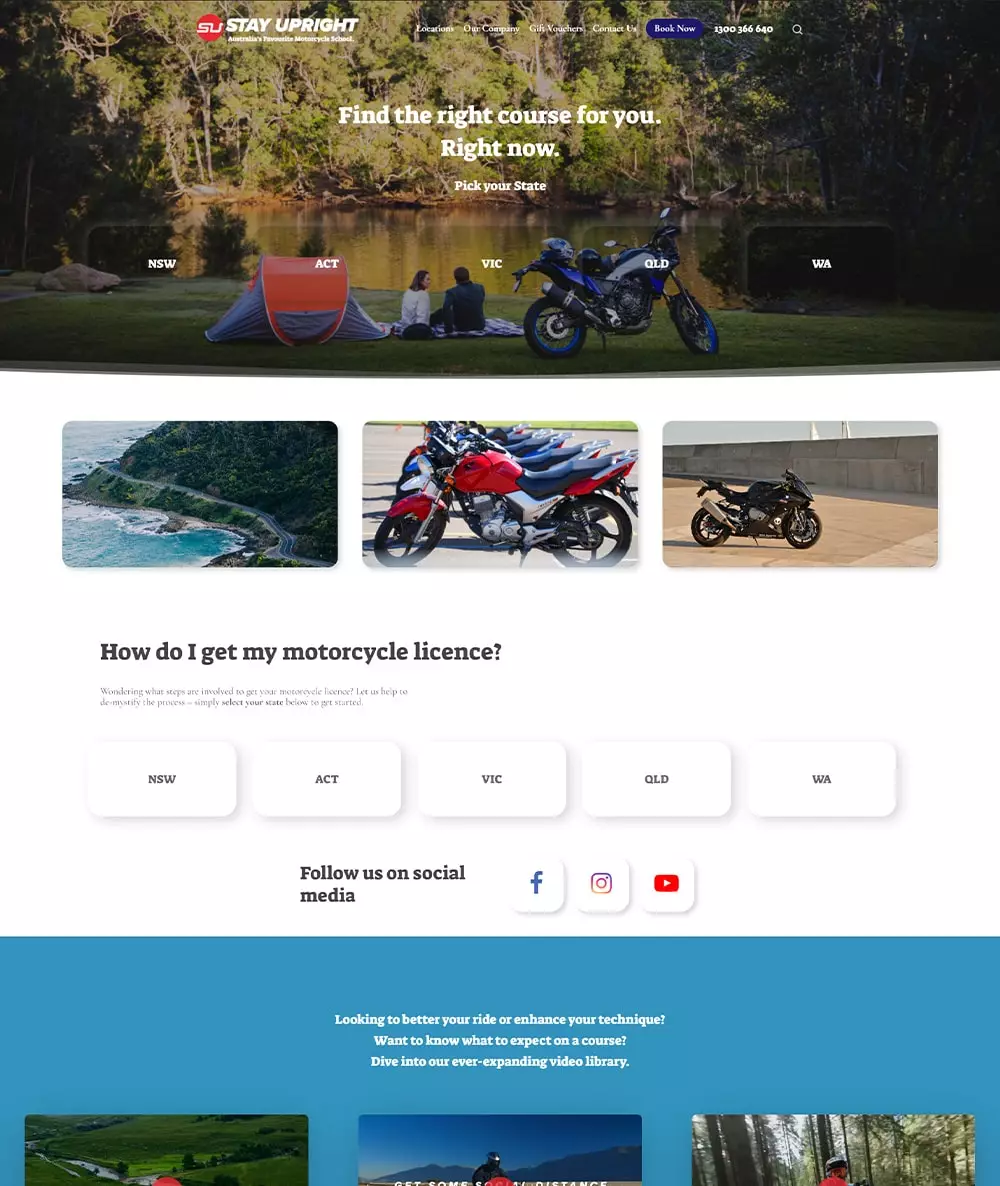
Old vs New
Ideation & Experience
The Stay Upright digital experience on the website needed a refresh
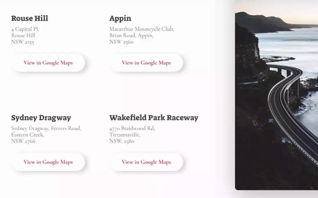
Our team thought of the user experience from an end user point of view and how quickly a user is able to reach their end objective – to book a course in their chosen state, close by or convenient to them and make a payment, all in just a few simple steps. We integrated the locations with Google Maps and ARLO as the payment gateway.
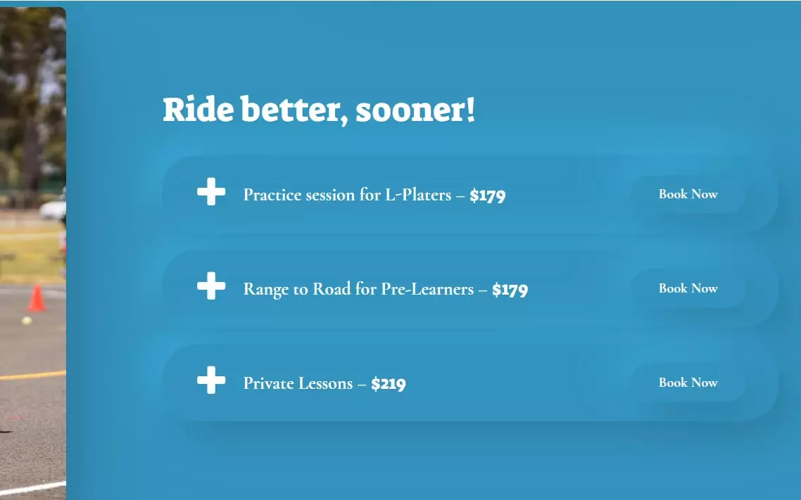
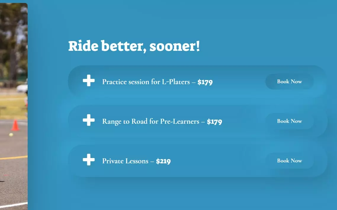
While the Stay Upright is built on WordPress as the chosen platform, we used Neomorphism as the chosen way to define the front end user experience.
”Thank you everyone. I couldn't be happier with how it looks and works.
AnnaliesseManaging Director, Stay Upright
”I am receiving lots of positive feedback around the new site, it’s layout and visual aspects are great.
KristyHR & Finance Manager, Stay Upright
Design
So, what is Neomorphism?
Some may have heard of the skeuomorphism approach made popular by the likes of Apple in the early user interface design or the several 3D real-looking app icons we saw in the past as a much popular trend.
Neomorphism is relatively new, a design language and a trend that the aesthetics of the interface is marked by a mix of the minimal simplicity of the flat designs trend we saw in the past few years and skeuomorphism which we saw with the likes of Apple etc and the design of almost real looking buttons and user interface designs. The key factor in neomorphism is how depth is treated which allows better focus on the different elements and how a user interacts with these neomorphic elements in the design.
Methodology
Stay Upright offers a variety of courses, are spread across all of Australian states and they offer services for a wide variety of riders, we designed the web experience to be very simple yet aesthetically pleasing with smarts such as Google Maps and location aware content, integration with ARLO as the payment gateway, Google Analytics and we wanted to ensure the brand, content and helpful content was also displayed in a way to was helped in the overall brand experience connecting with Stay Upright.
”I want to thank EVERYONE for your time and patience. In particular the guys at Mobiddiction. They have worked round the clock to get us here, and I am super happy with the result.
MarkMurphy & Friends

