”"Design is not just about creativity but being predictive in thinking about experience and business impact through intelligent technology."
- Mobiddiction Leadership Team
We are what we design.
This is our design philosophy at Mobiddiction, and we follow an innovative, AI-enhanced practice to ensure we deliver exceptional digital experience management solutions.
Our humans at Mobiddiction are seasoned experts with over a decade of experience, so while we tend use AI we firmly believe that any design practice must not only integrate with technology it must be first designed with human-centered design principles. Keeping business outcomes and end-user value as our north star, we focus on design methodologies that deliver comprehensive digital experiences with measurable ROI.
Working alongside our digital experience strategists and AI innovation team, we’ve refined our proven three-step methodology that combines traditional design thinking with artificial intelligence capabilities to accelerate insights, enhance decision-making, and optimise user experiences at scale.
Strategic Discovery & Experience Architecture

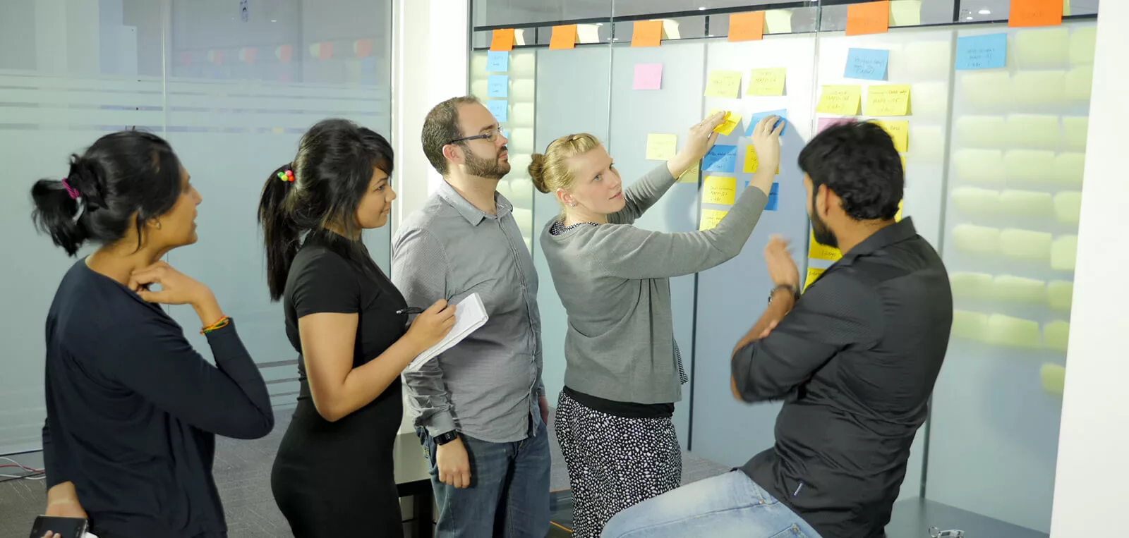
Drawing from Lean and Agile methodologies enhanced with AI-driven insights, we prioritise experience outcomes over traditional deliverables. Every engagement begins with our signature “Intelligence Sprint Zero” – a comprehensive discovery phase where we leverage machine learning algorithms to analyse market trends, user behaviour patterns, and competitive landscapes alongside stakeholder workshops.
Our ideation workshops identify innovation opportunities, business challenges, and digital experience optimisation potential through predictive analytics and sentiment analysis. We explore user personas using behavioural data mining and psychographic modelling to build deeper understanding of customer journeys and business impact, which feeds directly into our first Digital Experience Management deliverable: intelligent experience architecture mapping.
We use AI tools to analyse user interaction patterns, predict conversion pathways, and identify optimisation opportunities 75% faster than traditional discovery methods.
Smart Wireframing & Predictive User Journey Mapping
 Building upon our strategic foundation, we create sophisticated wireframes and user journey maps enhanced by machine learning insights. Our AI-powered wireframing process analyses interface patterns, user interaction heatmaps, and accessibility requirements to suggest optimal layouts and functionality priorities that drive business outcomes.
While capturing detailed wireframe specifications, our development team collaborates using AI-assisted prototyping tools that predict technical feasibility and performance implications. We create interactive prototypes using advanced platforms integrated with our thinking about tracking micro-interactions and predictive user behaviour patterns.
Predictive Analytics:Our AI models predict user drop-off points, conversion bottlenecks, and engagement optimisation opportunities before development begins, reducing iteration cycles by 60%.
Adaptive UI/UX Design & Digital Experience Optimisation across multiple touch points
Our final phase delivers comprehensive UI/UX design systems powered by AI-driven personalisation and adaptive design principles. We create complete design libraries that automatically adjust to user preferences, device capabilities, and business performance metrics in real-time.

Before initiating any design work, our AI business intelligence platform analyses brand positioning, market dynamics, and customer demographic data to ensure every interface element serves both user needs and business objectives. For enterprise clients serving specialised markets, our machine learning algorithms customise accessibility features, interaction patterns, and visual hierarchies to maximise engagement and conversion rates.
Context-aware design is central to our digital experience management approach. Our AI systems continuously analyse usage patterns, environmental factors, and business KPIs to optimise interface elements for maximum usability and commercial impact. We maintain our multi award winning expertise across iOS, Android, and web platforms ensuring consistent brand experience while adapting to platform-specific user expectations.
We design with industry standards such as Apple’s Human Interface Guidelines, Google’s Material Design and Meta’s Immersive VR interaction principles through our AI powered design systems that automatically flags inconsistencies and suggests optimisations in real time. We use insights to continuously learn from real world user interactions to refine design decisions and business outcomes.
Our design system continuously optimises user interfaces based on real-time performance data, increasing conversion rates by an average of 40% post-launch.
Ready to Transform Your Digital Experience?
Let our AI-powered design methodology drive your next digital transformation initiative.

